The Best Neutral Decor for People Who Hate Boring Rooms
As an Amazon Associate, I earn from qualifying purchases. This means I may earn a small commission when you click my linked images, at no extra cost to you. Clicking these links helps support my site and allows me to continue providing content. Thank you!
A neutral aesthetic might not be my first choice for myself and my own spaces, but that doesn’t mean I hate neutral decor. What I do hate, is a boring room, and the preconceived notion that neutral automatically equals boring. This is just not true, and to all of those that need a neutral space, but still want to infuse life and personality in the room, this one is for you.
Neutral rooms get blamed for a lot of things they didn’t actually do. Bland. Boring. Safe. Forgettable. But most of the time, the problem isn’t the colors, it’s that nothing committed. Beige didn’t fail you. The room just played it too safe, like it was afraid of making eye contact. It didn’t need more stuff; it needed one strong decision.
A neutral space done well isn’t empty or timid. It’s layered, intentional, and quietly confident. It knows where to pull back and where to push just a little. Texture replaces color. Shape replaces pattern. Lighting replaces chaos. When everything in a room is neutral, every single piece has to earn its place, because nothing is hiding behind a bold hue or a busy print.
If you love calm spaces but refuse to live in a room that feels like a waiting area with throw pillows, this is for you. This isn’t about making neutrals louder, it’s about making them smarter. Calm doesn’t have to mean boring. And neutral definitely doesn’t have to mean apologetic.
Texture Is the Color in Neutral Spaces
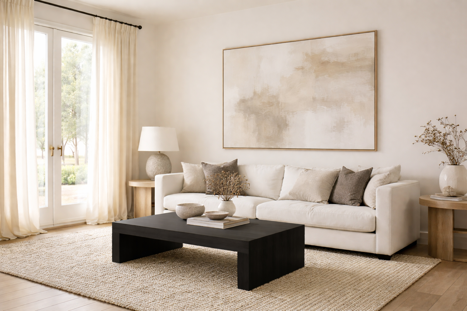
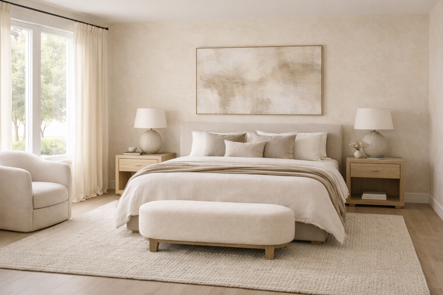
When you take bright color out of a room, something else has to step up and do the work. That something is texture. Texture is what keeps neutral rooms from feeling flat, or worse, like you gave up halfway through. If everything in the room is smooth, shiny, and the same shade of beige, your eye has nowhere to land. Congratulations, you’ve accidentally created a showroom.
Think of texture as the difference between a room that looks nice in photos and one that actually feels good to be in. Soft next to structured. Woven next to solid. Matte finishes instead of everything being glossy and reflective. You don’t need a lot of it, but you do need contrast, otherwise the room just kind of… sits there.
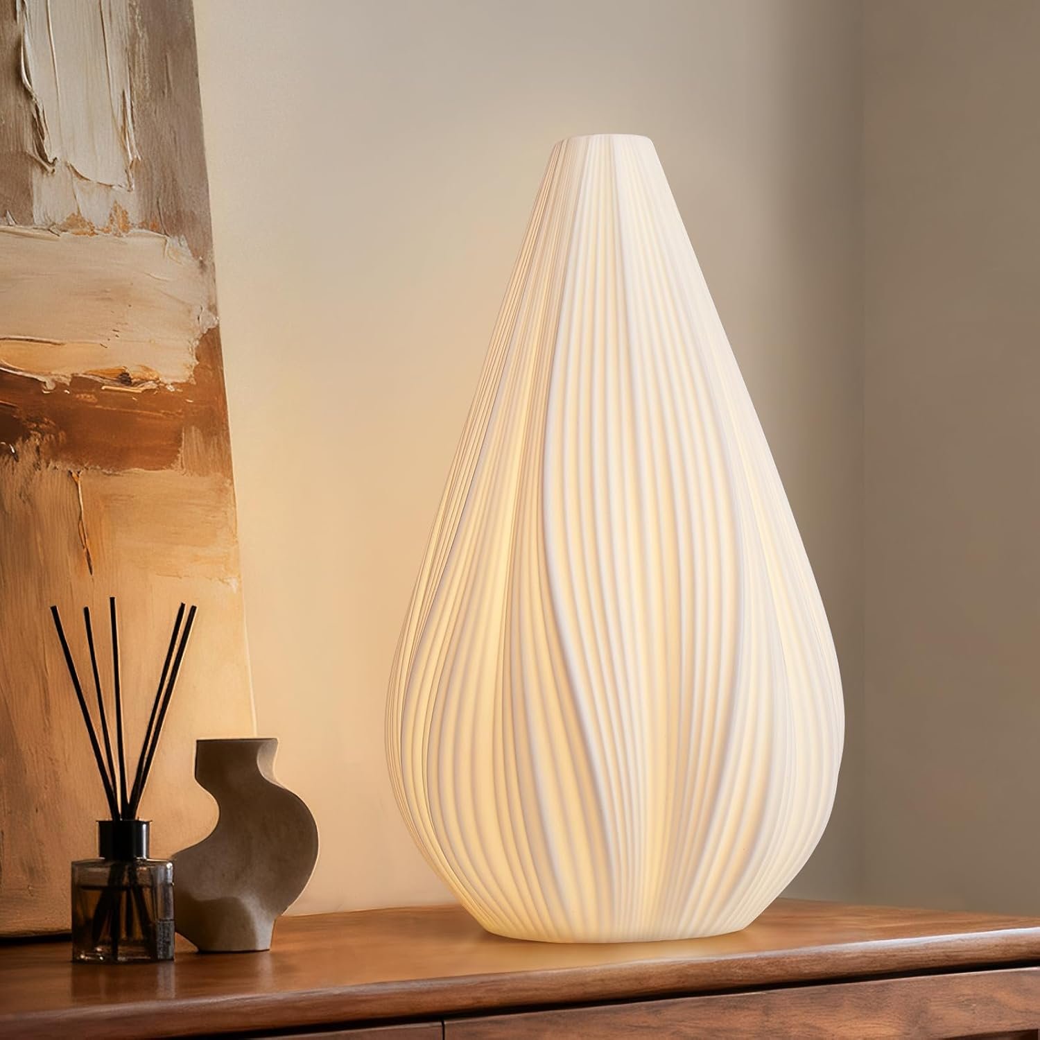
This is where neutral decor quietly gets interesting. A chunky rug under a clean lined sofa. A ceramic lamp that isn’t perfectly smooth. Linen curtains that hang a little casually instead of stiff and starched. None of these pieces are loud on their own, but together they create depth. They make the room feel layered and intentional without adding color or clutter.
If you’re ever stuck wondering why your neutral space feels boring, ask yourself one question: Does anything in this room feel different to the touch? If the answer is no, that’s your problem. Neutral rooms don’t need more stuff, they need better materials. Texture is the color you forgot to add. And yes, your room noticed.
Shape Does the Heavy Lifting
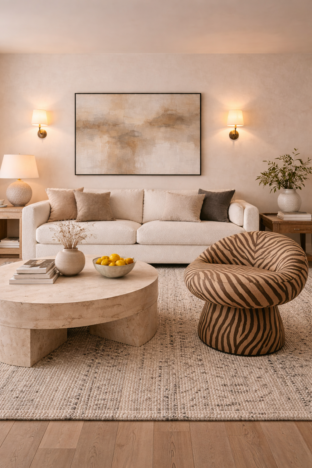
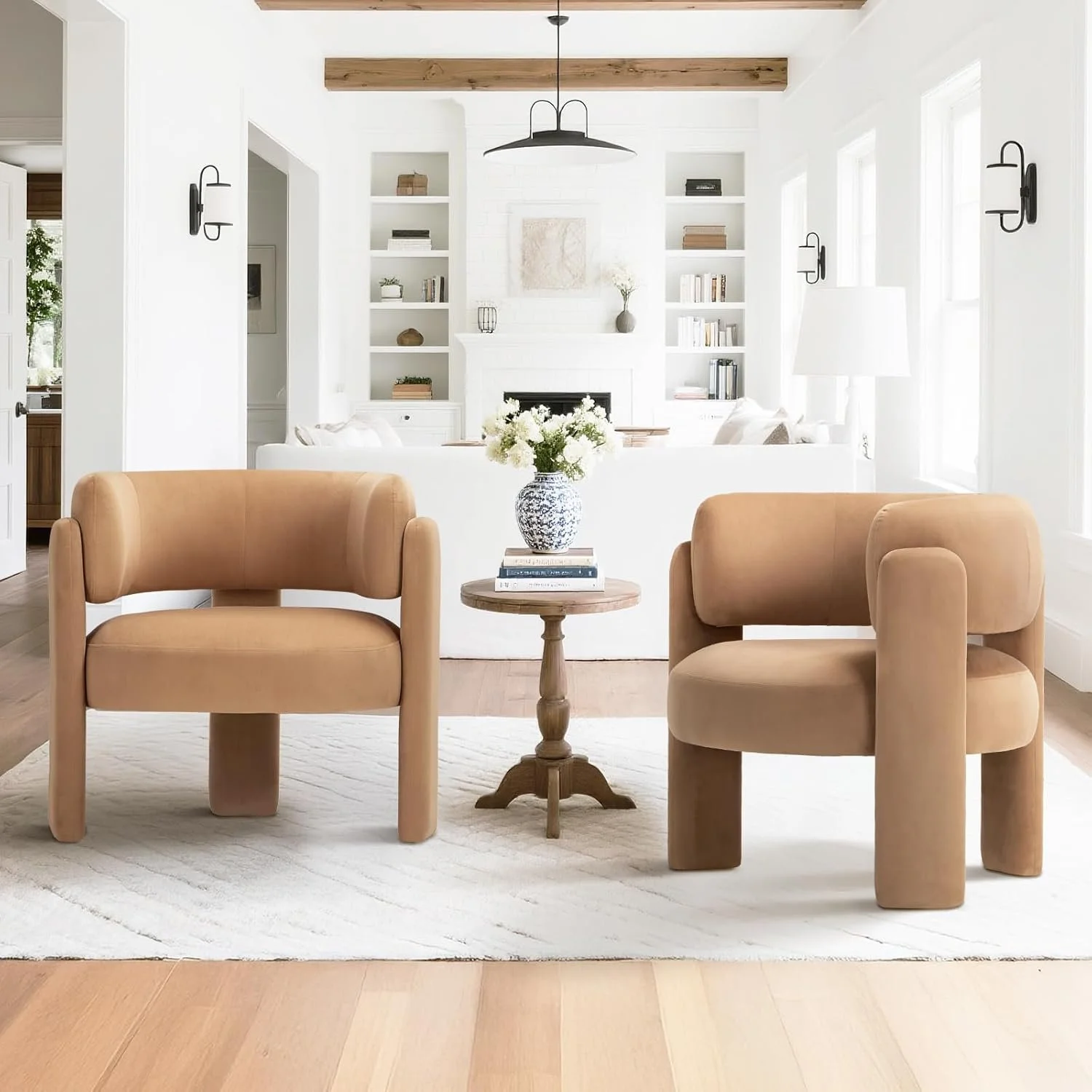
Once texture is doing its job, shape is what keeps a neutral room from feeling predictable. Since color isn’t stealing the spotlight, the outline of your furniture and decor matters more than you think. This is why some neutral rooms feel interesting and others feel like a showroom you walked through and immediately forgot, the kind where everything is “nice,” but you couldn’t describe a single piece five minutes later.
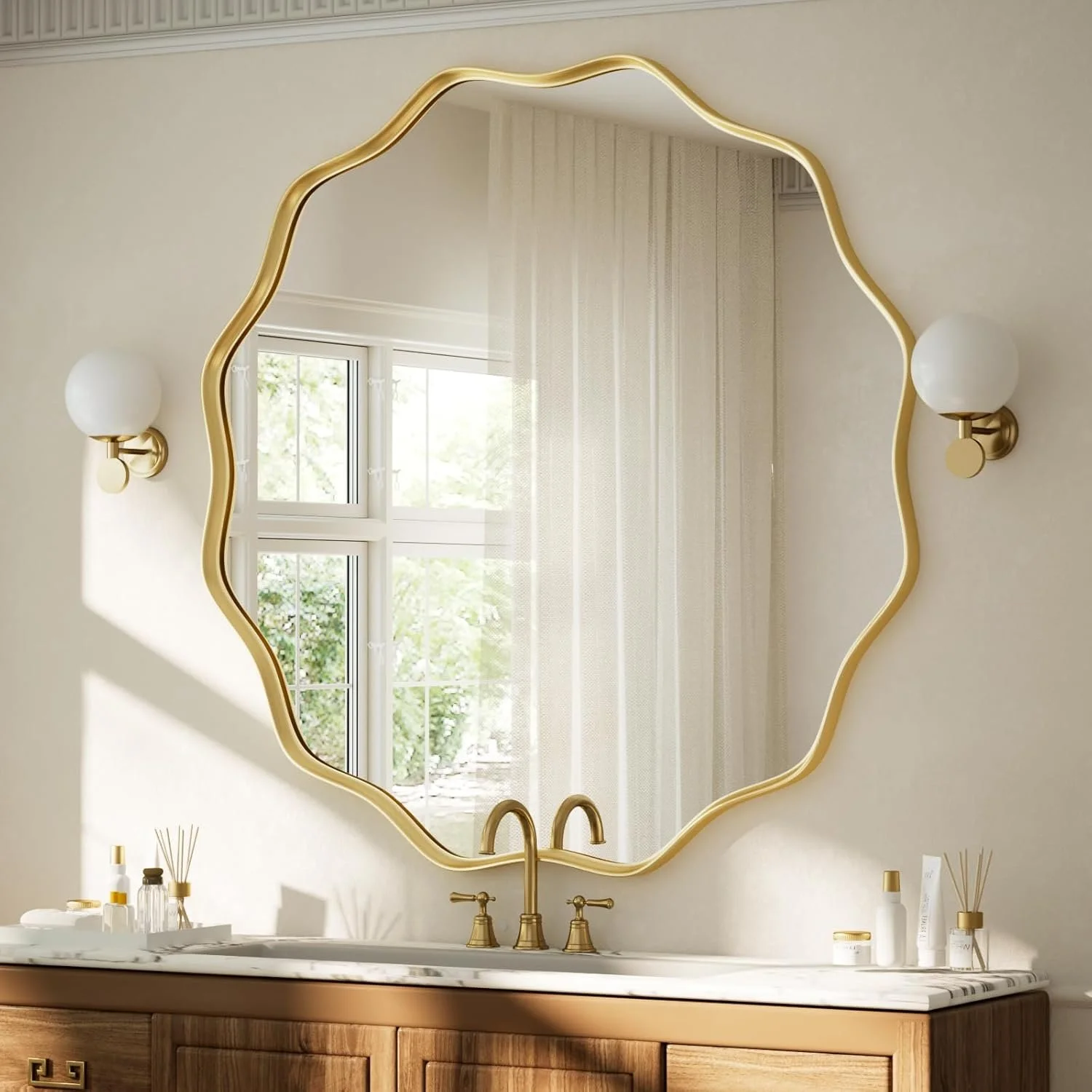
Shape is really just about variety. If everything in a room is boxy, straight, and perfectly normal, the space feels stiff. If everything is rounded and soft, it can feel a little too mushy. The magic happens in the mix. A curved lamp on a straight console. A round mirror over a rectangular dresser. One unexpected shape can completely change how a room feels.
This is also why fewer, larger pieces usually work better than lots of small ones. One sculptural lamp or a bold coffee table does more than five tiny decor items scattered around trying to be helpful. Neutral rooms don’t need more accessories, they need one or two pieces with a point of view.
If you’re ever stuck styling a neutral space, try this: look around and count how many rectangles you have. Sofas, tables, rugs, frames, it adds up fast. Rectangles are already doing a lot. They don’t need to run your entire life. Add one thing that breaks the pattern, a curve, an arch, something slightly unexpected, and the room usually snaps into place.
Contrast Is Not Optional
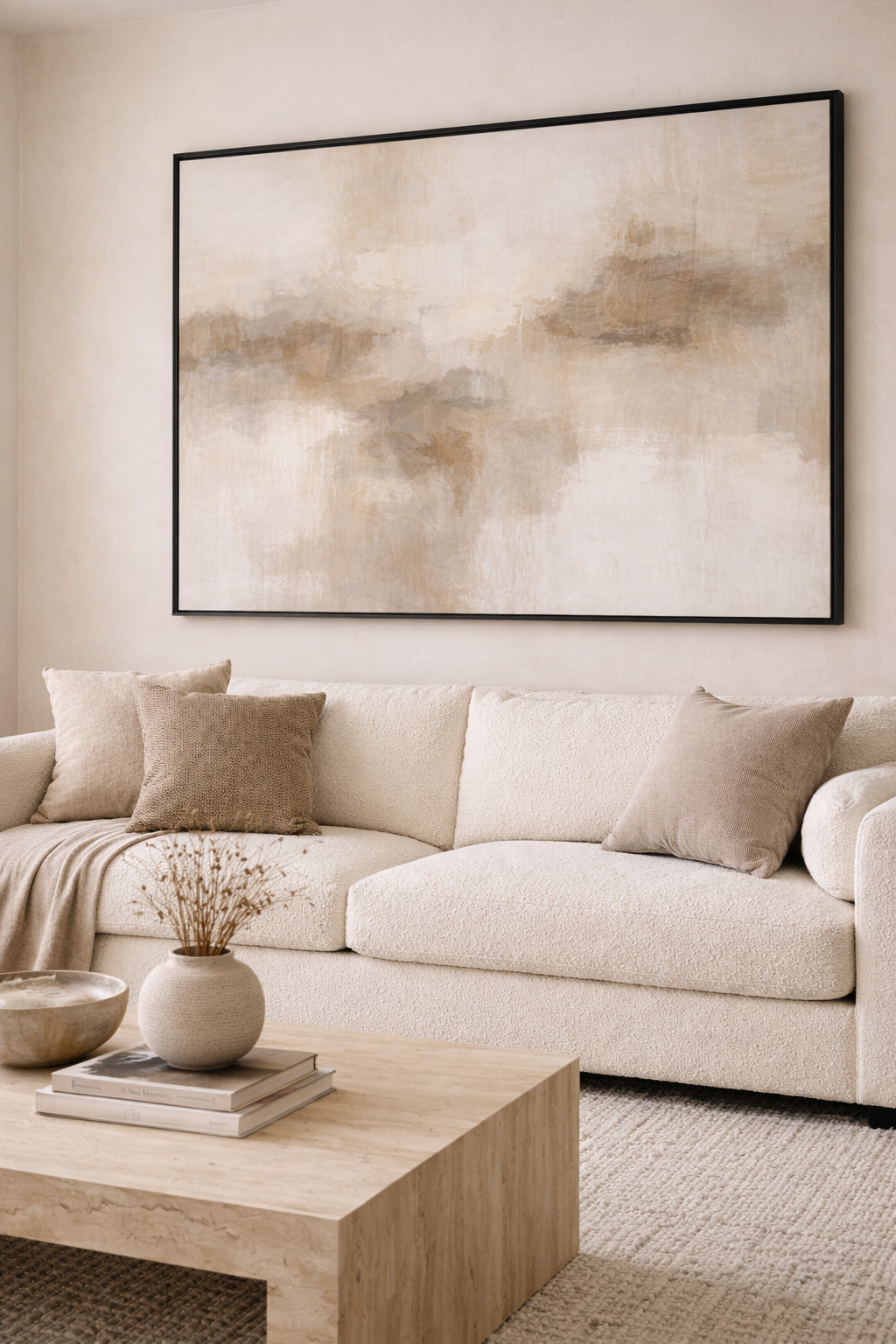
Even the best shapes and textures won’t save a neutral room if everything is the same tone. Beige on beige on beige sounds calming in theory. In real life, it’s just tired. Contrast is what gives a neutral room depth, definition, and a little backbone.
Contrast doesn’t mean bold color. It means light next to dark. Smooth next to rough. Soft next to structured. A light sofa looks better when there’s something darker nearby to ground it. Pale walls feel warmer when there’s a deeper wood tone or a black accent to keep everything from floating away.
This is where neutral rooms often get stuck. People worry that adding something darker will ruin the calm feeling, so they keep everything safe. But the opposite is usually true. A touch of contrast actually makes the room feel more relaxed, because your eye knows where things begin and end. Nothing feels muddy or accidental, or like the room is waiting on you to finish the thought.
If your neutral space feels flat, try this before buying anything new: add one darker element. A lamp. A frame. A side table. You don’t need much. Neutral rooms don’t need to be loud, but they do need something to push back just a little.
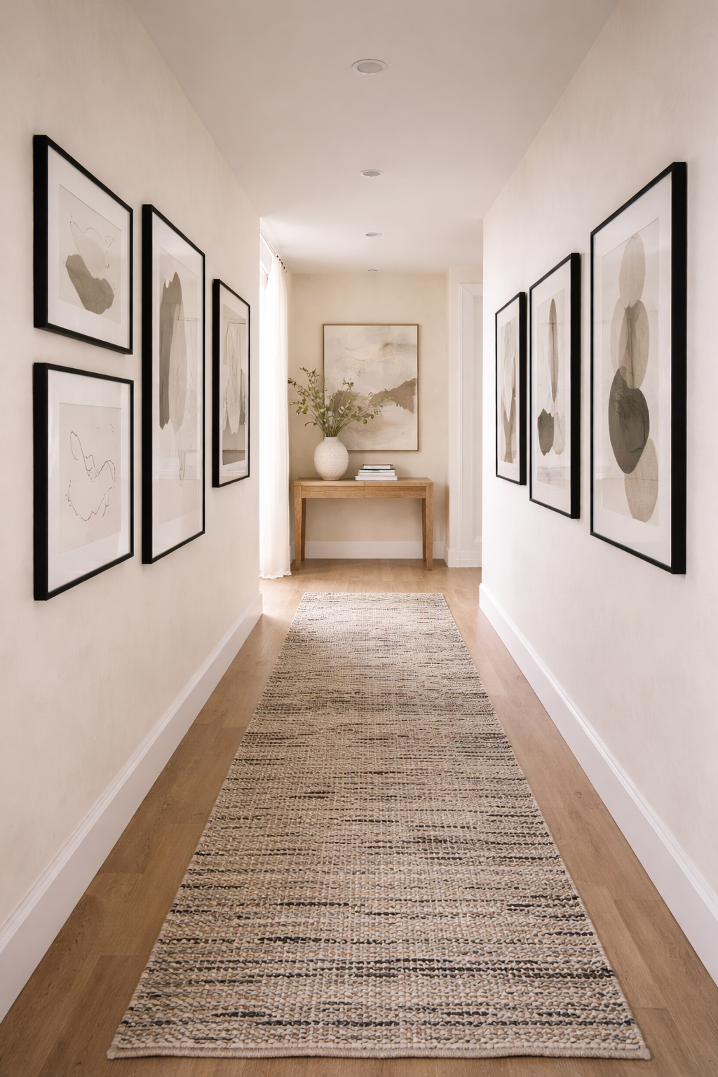
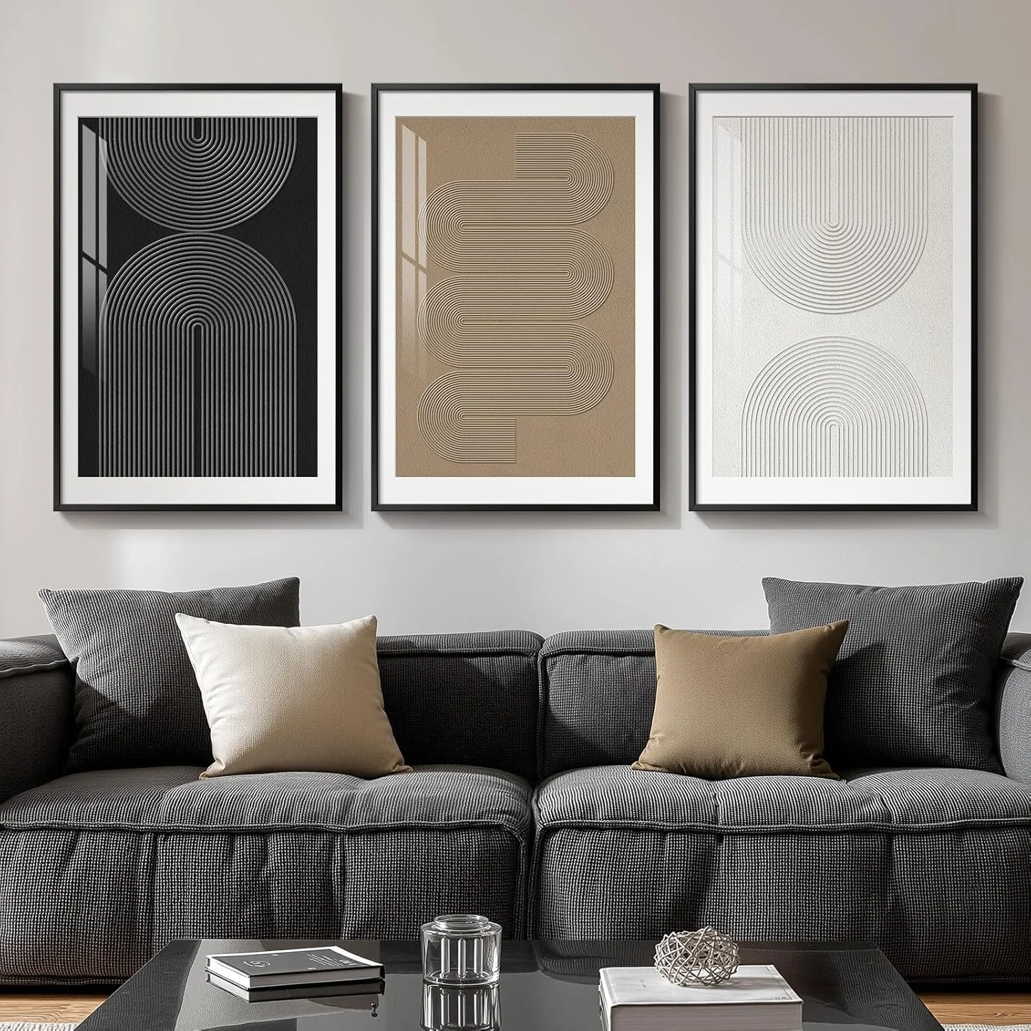
Art Is Where Neutral Rooms Get Their Personality
If neutral rooms had a personality test, art is the part where they finally answer honestly. Without it, a neutral space can feel calm, but also anonymous. Like it could belong to anyone. Or worse, like a short-term rental that “sleeps six.” My personal design nightmare. No judgment. Okay, some judgment.
Art is what keeps neutral rooms from feeling polite and forgettable. It’s where you get to say something without repainting a wall or committing to a bold sofa you’ll panic about later. And no, it doesn’t have to be loud or colorful to work, it just has to be intentional.
One good piece of art will always beat five random ones, especially in a neutral room. A larger print with movement, texture, or an interesting shape gives your eye somewhere to land. It creates tension in a good way, the kind that makes a room feel finished instead of decorated out of obligation.
Art doesn’t need to match your sofa. It doesn’t need to explain itself. And it definitely doesn’t need to be inspirational text unless that text is doing something truly unexpected. Your sofa will survive. If the art makes the room feel more like you and less like a catalog, it’s doing its job.
Lighting Is the Star of the Show
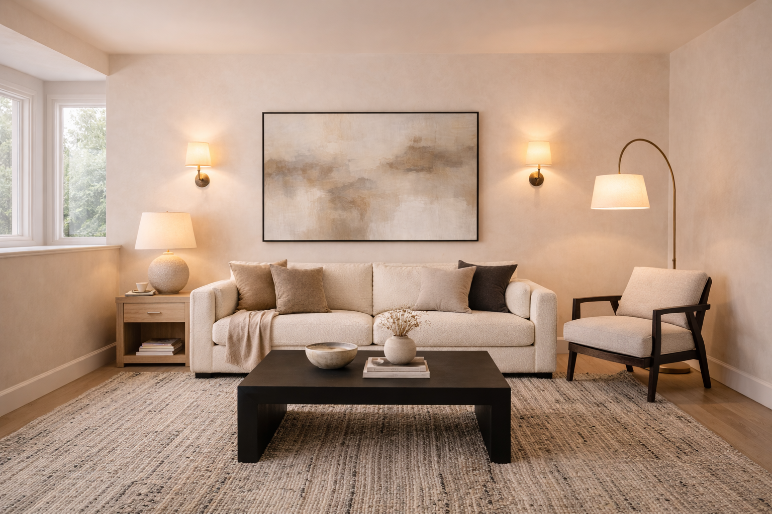
If a neutral room feels flat, awkward, or slightly depressing, it’s almost always a lighting problem. Not a paint problem. Not a rug problem. A lighting problem. Lighting is the difference between a room that feels calm and one that feels like it’s waiting for a dentist to call your name. Fluorescent lighting has never helped anyone emotionally.
Neutral spaces rely on lighting more than colorful ones because there’s nothing else doing the emotional heavy lifting. When the light is bad, everything looks worse. When the light is good, suddenly the same furniture feels intentional, cozy, and like you know what you’re doing.
The biggest mistake people make is relying on one overhead light and calling it a day. Overhead lights are fine, they just shouldn’t be running the show. If your overhead light is doing all the work, it’s doing too much. Neutral rooms need layers: a lamp here, a sconce there, something at eye level that makes the space feel warm instead of washed out. Think less stadium lighting, more “I live here and I like it.”
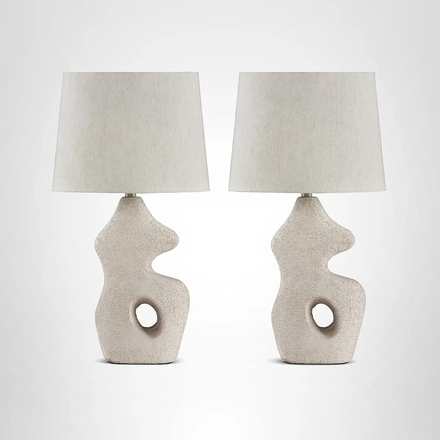
This is also where personality sneaks in. A sculptural lamp or a slightly oversized fixture can act like decor even when it’s turned off. In neutral rooms, lighting isn’t just functional, it’s one of the easiest ways to add shape, contrast, and a little drama without adding color.
If you’re only going to splurge on one thing in a neutral room, make it lighting. Paint is cheap. Pillows come and go. Good lighting changes how everything else looks, including you, which honestly matters.
Every Neutral Room Needs Something Slightly Unexpected
By now, we’ve covered the rules: texture, shape, contrast, lighting. But the rooms that actually feel memorable usually bend one of those rules just a little. Not break it. We’re not living dangerously, just confidently.
This doesn’t mean chaos. It’s usually one quiet decision: an unusual shape, a slightly oversized piece, something that doesn’t perfectly match but still belongs. The kind of detail you notice without needing it explained.
That single unexpected choice keeps a neutral room from feeling overly careful. It adds just enough tension to make the space feel designed instead of assembled.
If everything in your neutral room makes immediate sense, that’s your sign. The best rooms almost always include one moment that makes you pause, not to question it, just to notice it.
What I Skip (Even Though Everyone Else Loves It)
Just because something is popular doesn’t mean it works in every neutral room. Some trends photograph beautifully and fall completely flat in real life. Instagram lighting is a liar, especially when you’re trying to keep a space calm and interesting.
I skip overly matchy sets. When everything comes from the same shelf, the room loses its personality. Neutral rooms need contrast and tension, not perfect coordination. I’d rather see one piece that feels slightly out of place than a room where everything agrees too much.
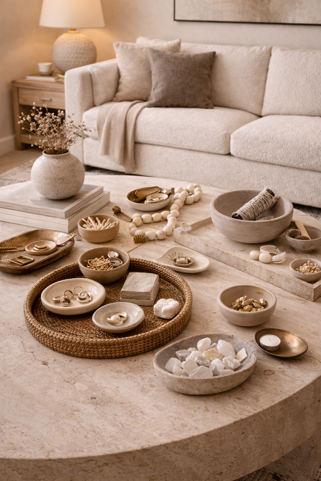
I also skip tiny decor clutter. Little bowls, little objects, little stacks of things that don’t actually do anything. They disappear visually and just create more to dust. Neutral rooms almost always benefit from fewer, larger pieces that can hold their own.
All white everything is another one I approach carefully. White can be beautiful, but without variation in tone, texture, or contrast, it starts to feel sterile instead of serene. Neutral doesn’t mean stripping all the depth out of a space.
And finally, trend-only neutrals. If a piece only works because it’s “in” right now, I leave it behind. Neutral rooms rely on longevity. Replacing everything every trend cycle is exhausting. And expensive. And emotionally draining.
The Neutral Pieces That Do the Work
As an Amazon Associate, I earn from qualifying purchases. This means I may earn a small commission when you click my linked images, at no extra cost to you. Clicking these links helps support my site and allows me to continue providing content. Thank you!
If a neutral room feels off, the solution is almost never more decor. It’s better decor. Pieces that show up, pull their weight, and quietly make everything around them look more intentional.
These are the categories I reach for when a neutral space feels flat, floaty, or just a little too polite.
Pieces That Add Weight (and Anchor the Room)
These are the pieces that keep a neutral room from feeling like it might drift away. When a space feels unfinished, it’s usually missing something with presence: scale, depth, or visual gravity.
Think larger art, oversized lamps, darker finishes, or furniture that doesn’t apologize for existing. One of these is often all it takes to make the room feel grounded and complete.
These are the kinds of pieces that give a neutral room something to lean on.
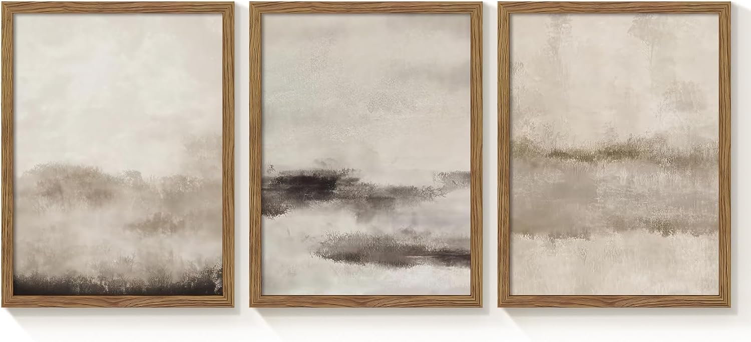
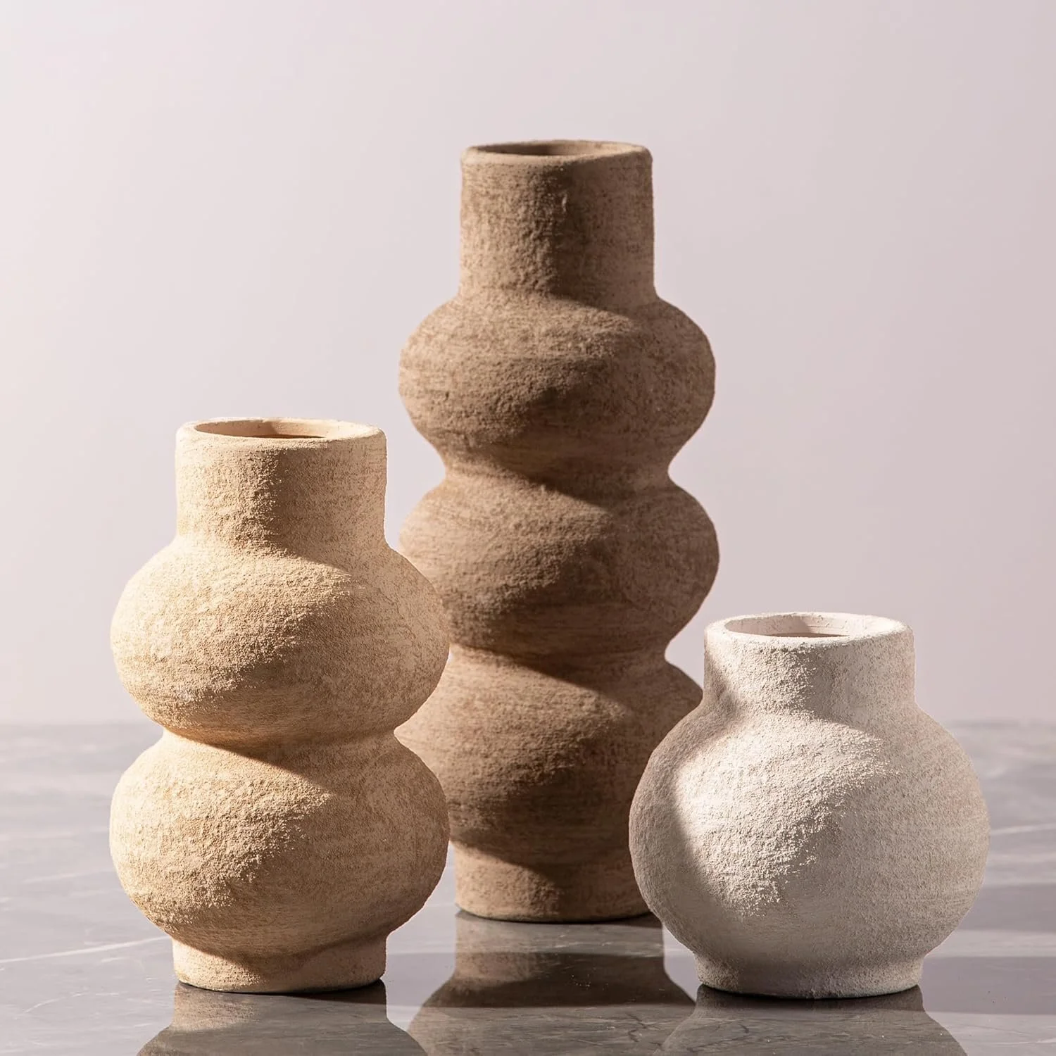
Pieces That Add Texture (Without Adding Clutter)
When color steps back, texture has to step up. These are the pieces that make a room feel layered and lived-in instead of smooth and forgettable.
Textured rugs, ceramic or plaster lamps, linen curtains, stone or matte objects, nothing loud, nothing fussy. Just materials that feel good and make the space more interesting without adding visual noise.
This is where neutral rooms quietly get their depth.
Pieces That Add Contrast (Quietly)
Contrast doesn’t need to be dramatic to work. It just needs to exist. These are the pieces that create definition: the dark note in a light room, the thing that helps your eye understand where one element ends and another begins.
A black frame, a bronze lamp, a darker accent piece. Small choices, big payoff.
Neutral rooms don’t need chaos. They need clarity.
Arched Full Length Wood Mirror
Pieces That Add Personality (Without Chaos)
Every neutral room needs one piece that feels a little more like a decision and a little less like a default. This is where personality sneaks in, without turning the room into a performance.
Statement art, sculptural lighting, an unusual mirror, or one object that makes people pause before saying, “Oh, I like that.” One is enough. Two is generous. More than that is trying too hard.
This is the difference between a room that’s nice and a room that’s memorable.
*A Quiet Reminder Before You Shop
You don’t need one thing from every category. Most rooms only need one or two better decisions, not a cart full of maybes.
Final Thoughts
The best neutral rooms don’t feel boring because they aren’t trying to be perfect. They’re edited, layered, and intentional, with enough texture, contrast, and personality to feel finished without feeling fussy.
Neutral doesn’t need rescuing. It just needs commitment. Strong shapes. Real materials. Lighting that knows what it’s doing. And one element that feels slightly unexpected, because that’s what keeps a room from feeling polite and forgettable.
The pieces below are the kinds of neutrals I reach for when I want a space to feel calm but considered, items that hold their own, support the room quietly, and never rely on color to do the heavy lifting. They aren’t filler. They’re the finish.