Interior Trends I Love (and the Ones I Use Carefully)
AI Rendering
Interior design trends are all over the place right now and honestly, that’s not a bad thing. There’s more variety than ever, which means there’s something for everyone to respond to. Glamorous, minimal, colorful, restrained, bold, quiet, no matter your taste, there’s a trend that will speak to you.
Where things get tricky is when a single trend is expected to carry an entire home.
Trends are meant to inspire, not dictate. They’re ideas to borrow from, not rules to follow room by room. When a home becomes overly committed to one specific look, the entirety of the design can appear to be a bit gimmicky.
The spaces that feel the most interesting, and the most personal, are the ones that pull thoughtfully from different styles, edit along the way, and leave room for evolution.
That’s how I approach trends in my own home: I take what resonates, use it intentionally, and let the rest go. I’m a maximalist girly at heart, but even I can’t function with every room being over the top. There has to be some variety.
Some trends I fully embrace. Some I love with limits. And some simply aren’t for me at all. The main point of it is, this is my own personal preference of design, and how I like to design a house for me and my family. You might agree with me on some points, all points, no points. That’s okay. Everyone is different, and our homes should be too. That’s why it’s important to balance trends with the essence of those that live in the space, and not let the trend take the reins of the design.
This is my honest take on interior trends this year, designed to be mixed, layered, and lived in.
The Interior Trends I Genuinely Love
Maximalism (Design Forward, Not Stuff Forward)
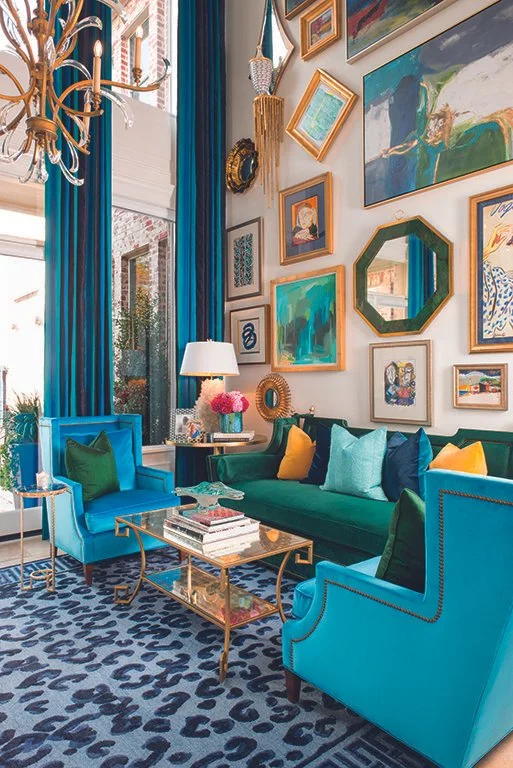
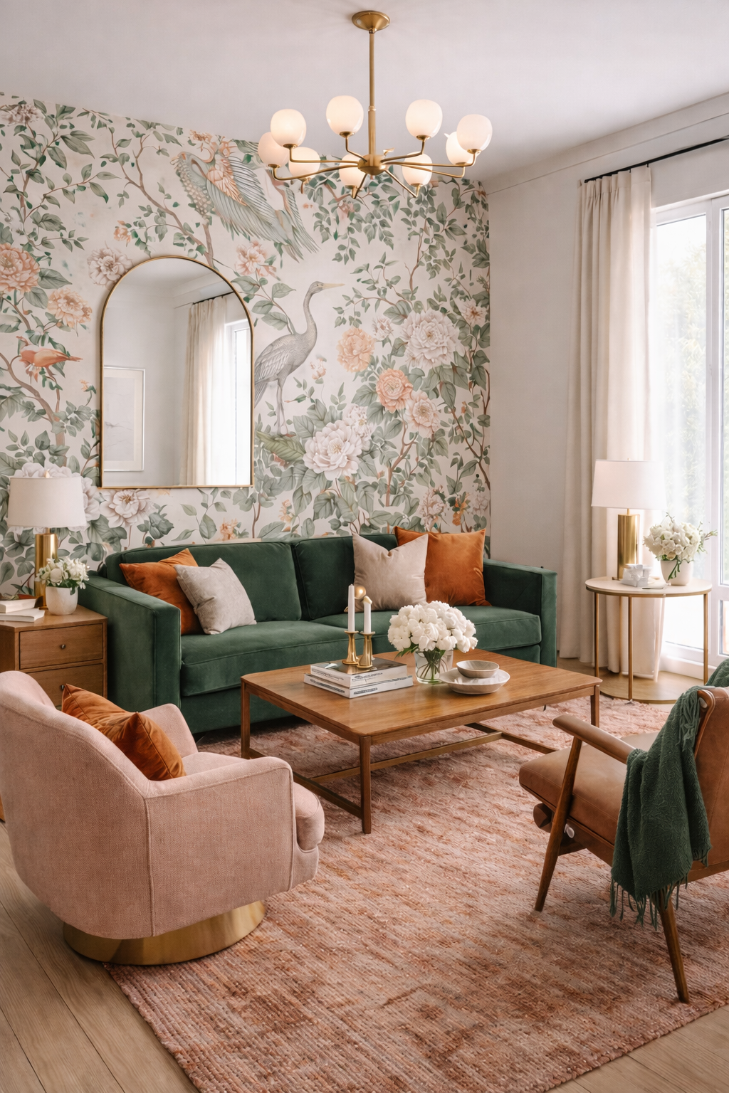
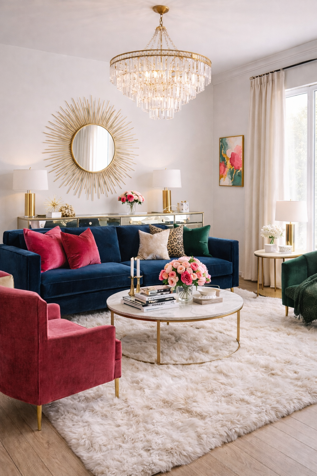
Maximalism gets a bad reputation because it’s often confused with clutter. But true maximalism is about layers, color, pattern, texture, art, not excess stuff. When everything has a purpose, bold design feels energizing rather than chaotic. True maximalism, when done with design and not just things, is my personal favorite. It’s full of personality, and the space becomes truly tailored to the people living in that space. To me, this is the most important thing interior design can do, be a visual representation of the personalities in the home.
Color Drenching
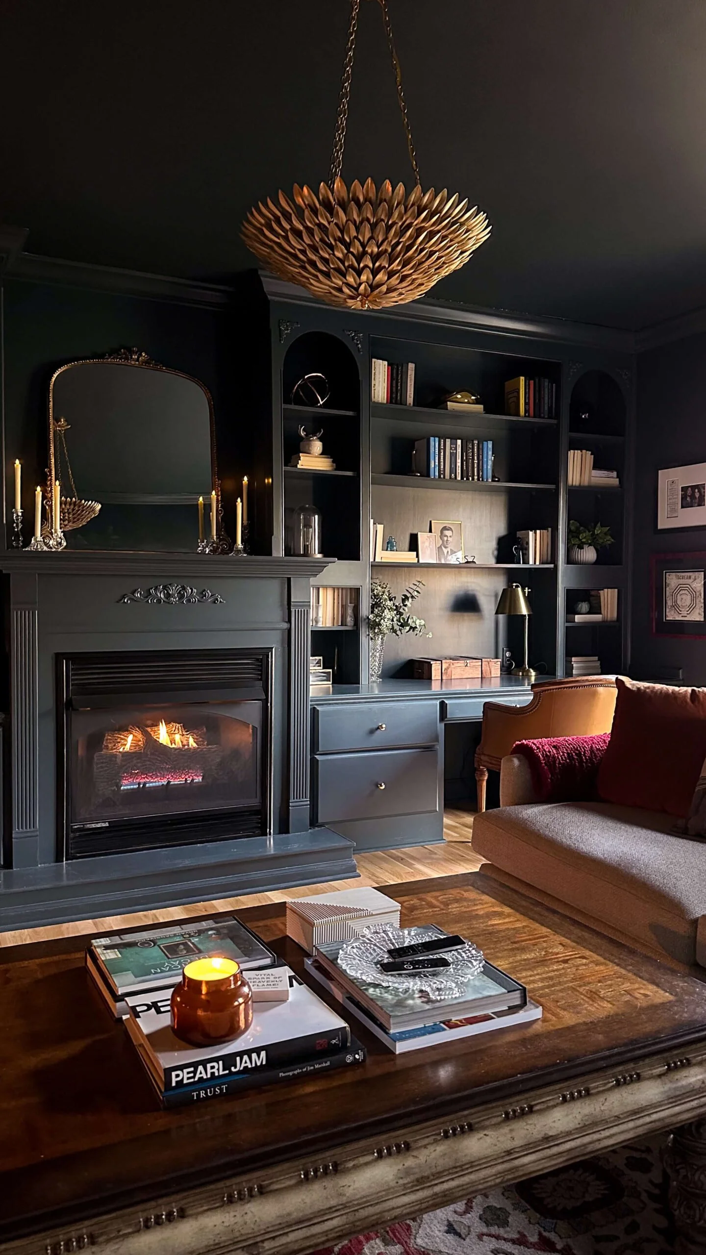
I love color drenching when it’s done with confidence and restraint. Rich tones that wrap a room create mood and intimacy, especially in spaces meant to feel cozy rather than bright. It’s not about being loud, it’s about being immersive. Color drenching also prevents the stark white ceiling breaking through your carefully curated design, and allows for a continuous flow for your eyes.
If your color isn’t very bold to start with, then there really should be no fear with color drenching. It’s when the colors get bold and daring that people tend to shy away from the idea of incorporating the fifth wall (the ceiling).
Glam
AI Rendering
I love glam interiors when they feel polished, intentional, and a little dramatic, in the best way. Glam doesn’t have to mean over the top or overly feminine; it’s about shine, contrast, and a sense of luxury that feels curated rather than chaotic.
I’m drawn to spaces that use glam elements thoughtfully: reflective finishes, sculptural lighting, rich materials, and moments of symmetry. It’s less about sparkle everywhere and more about knowing exactly where to place it.
When glam is done well, it elevates a space instantly. When it’s overdone, it loses its sophistication. Like most good designs, restraint is what makes it feel special.
Art Deco
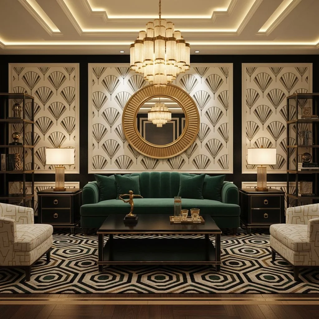
Art Deco will always have my heart. The glamour, the symmetry, the geometry, it’s confident and luxurious without being precious. I love the drama of it, the polish, the way it instantly elevates a space.
Even in small doses, arched mirrors, bold lighting, graphic patterns, Art Deco brings a sense of intention and quiet drama that never feels boring.
What makes Art Deco timeless is its balance of order and indulgence. It’s glamorous without being delicate, bold without being chaotic. Even when used sparingly, it brings a sense of sophistication and confidence to a space.
In modern homes, Art Deco works best in details rather than full immersion: a geometric mirror, a sculptural light fixture, an arched form, or metallic accents layered into an otherwise contemporary room. These moments add depth and elegance without making a space feel themed or dated.
Trends I Like (With Limits)
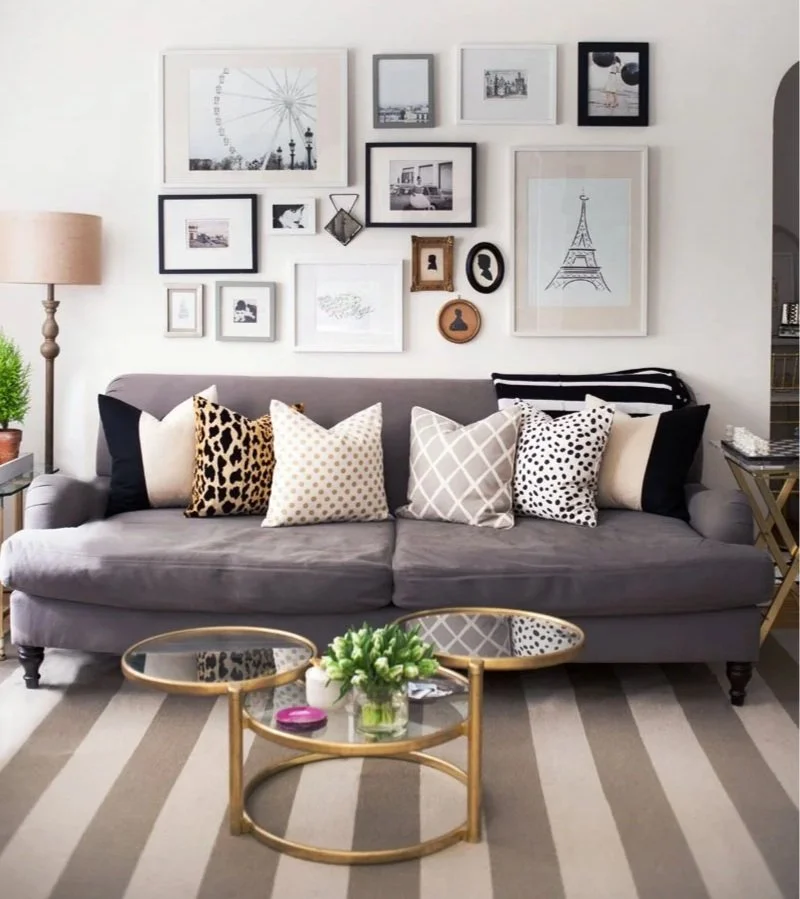
Gallery Walls
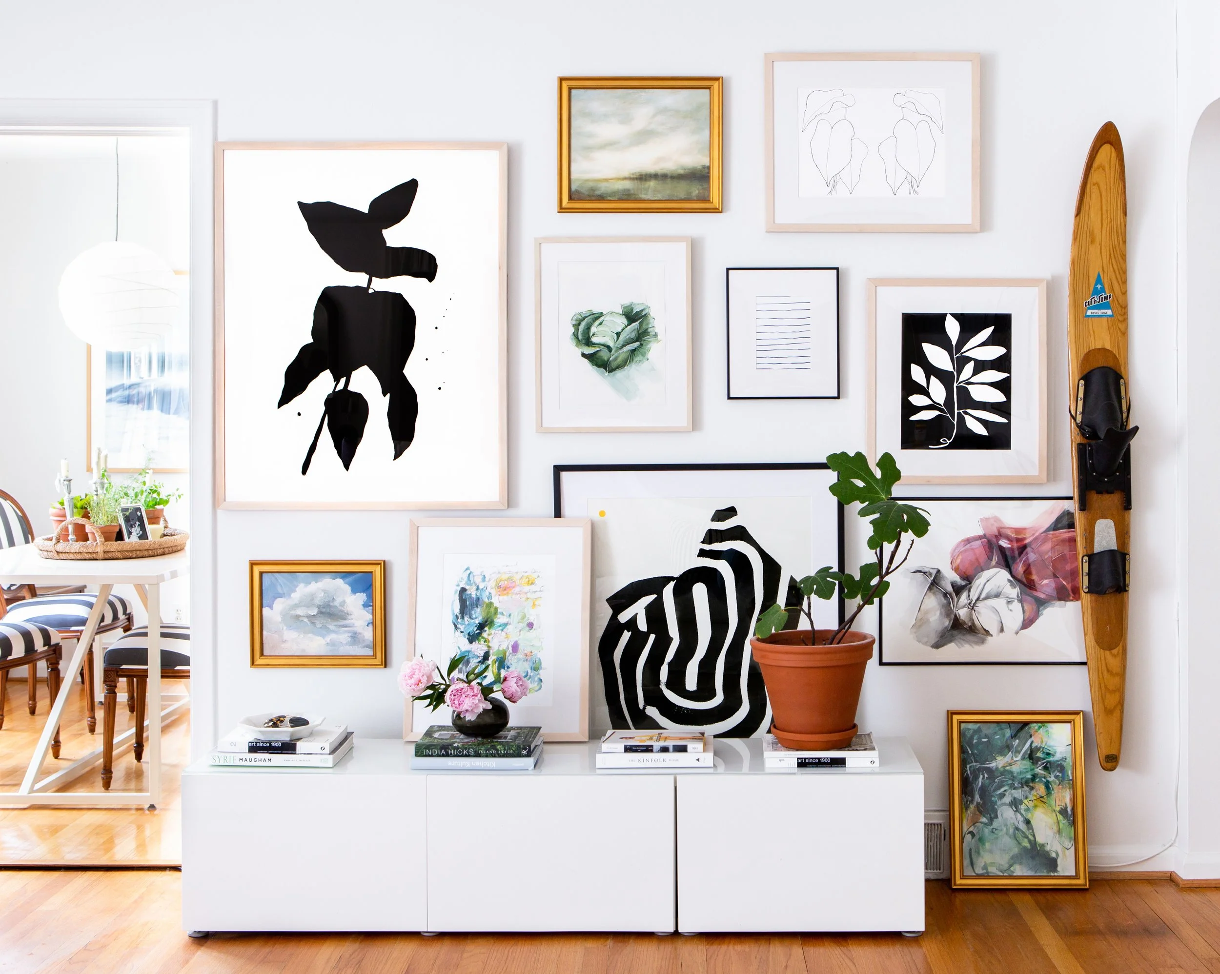
This one is tricky. Personally, when I see empty wall space, the maximalist in me says “what can go there?”. However, even I have my limits. One gallery wall per room should be the maximum. Think about an art gallery, how there’s white space and room between the installations. This gives space for the artwork to shine. When there’s no empty wall space, there’s no break for the eye, and no chance to let the artwork pop.
Statement Wallpaper
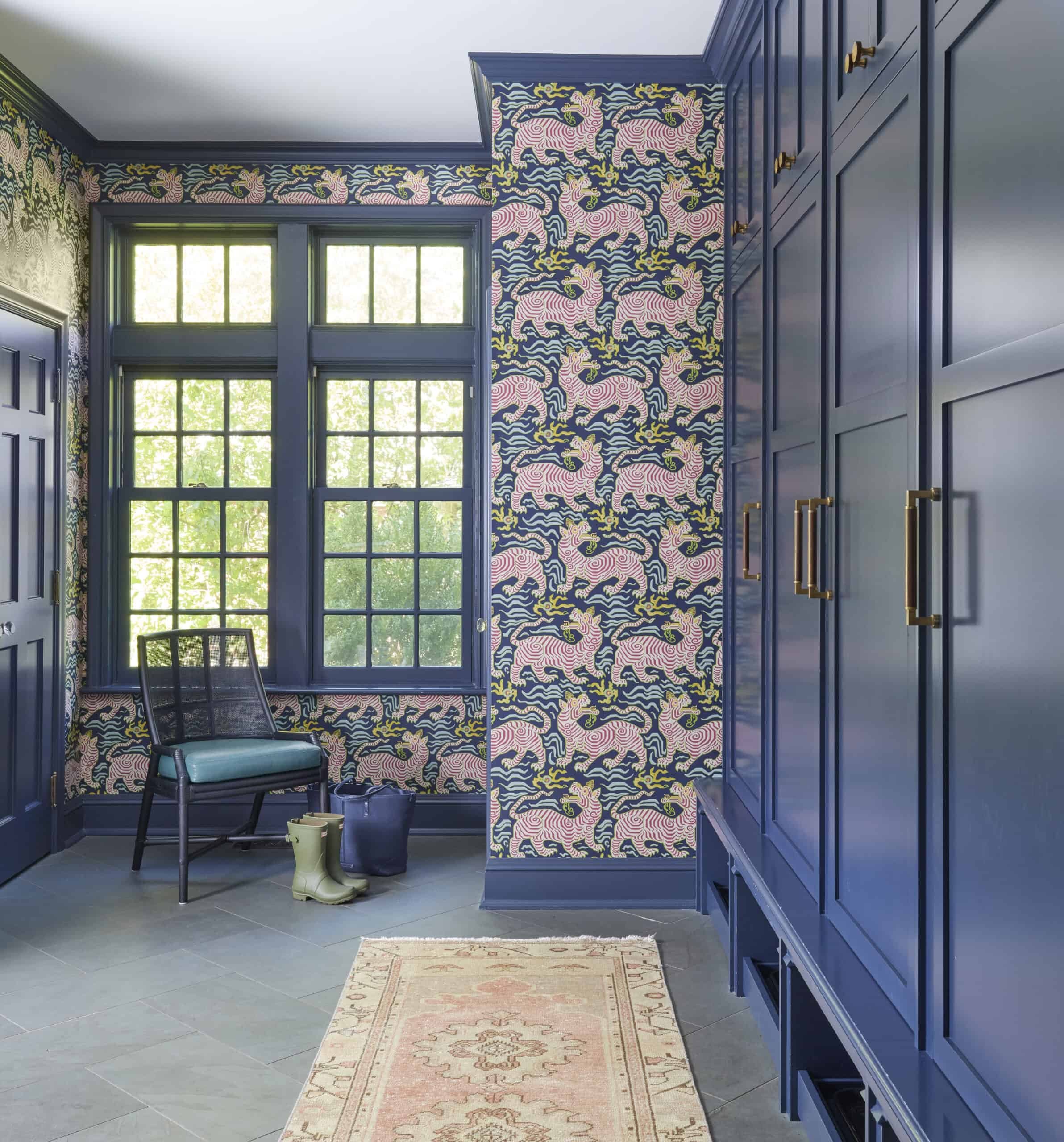
Bold wallpaper can be transformative, but it works best when it’s allowed to be the star. Being a maximalist, I’m a big fan of statement wallpaper, and use it often in various spaces in my home. What I am, however, is specific about my wallpaper placement. In one continuous area that’s open, I have one wall with statement wall paper. The rest of my wallpaper is featured in rooms off to the side and behind a door (on the ceiling) and on the next floor of my home. You don’t want to stand in one room with statement wallpaper, and look directly into another space with its own statement wallpaper. Give each statement wallpaper a chance to make their statement, and not have to compete with other things.
Curved Furniture
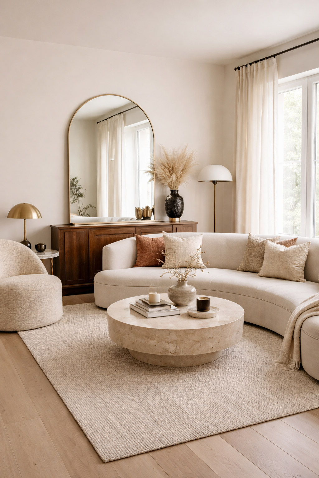
AI Rendering
Curved furniture brings softness to a space in a way straight lines simply can’t. In rooms filled with rectangles, walls, windows, rugs, cabinets, curves act as a visual break. They slow the eye down and make a room feel more inviting.
That’s the appeal.
Where curved furniture shines is in contrast. A curved sofa against a straight wall. A round coffee table anchoring a boxy seating arrangement. An arched mirror softening an otherwise angular room. One curved element can completely change the energy of a space.
The key is intention. Curves are meant to be focal points, not filler. When too many rounded pieces compete for attention, a room can start to feel undefined or overly trendy. One or two well placed curves tend to have more impact than an entire room of soft edges.
Curved furniture also works especially well in homes that lean bold. In maximalist or glam spaces, curves prevent things from feeling sharp or heavy. They add a sense of ease that balances richer materials, darker colors, and layered textures.
If you’re hesitant to commit, start small. A round side table, a curved-back chair, or an arched floor mirror introduces the idea without overwhelming the room. These pieces are easy to live with, and easy to edit later if your tastes shift.
Curves shouldn’t dominate a space. They should support it. When used thoughtfully, curved furniture feels less like a trend and more like a design tool you’ll keep reaching for.
Mid-Century Modern
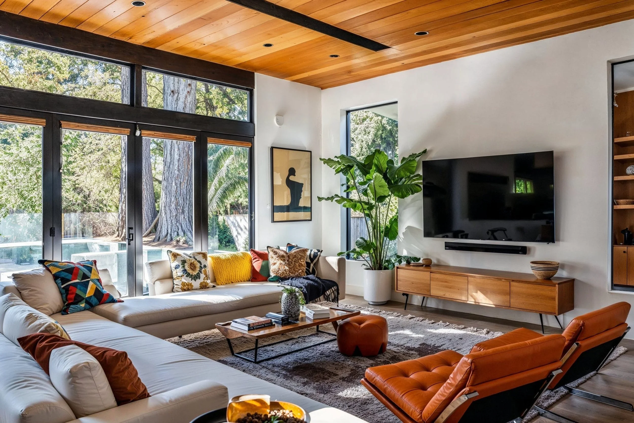
Mid-Century Modern was originally about good design being accessible—pieces that were beautiful, useful, and built to last. You’ll often see warm wood tones, low-profile silhouettes, tapered legs, and organic shapes, balanced with a sense of practicality.
Where the style can feel tricky today is in scale and saturation. Too much Mid-Century in one space can lean dark or dated, especially when heavy woods and vintage color palettes dominate. When used thoughtfully, though, one sculptural chair, a classic silhouette, or a warm wood accent, it adds depth and timelessness without overpowering a room.
Open Shelving
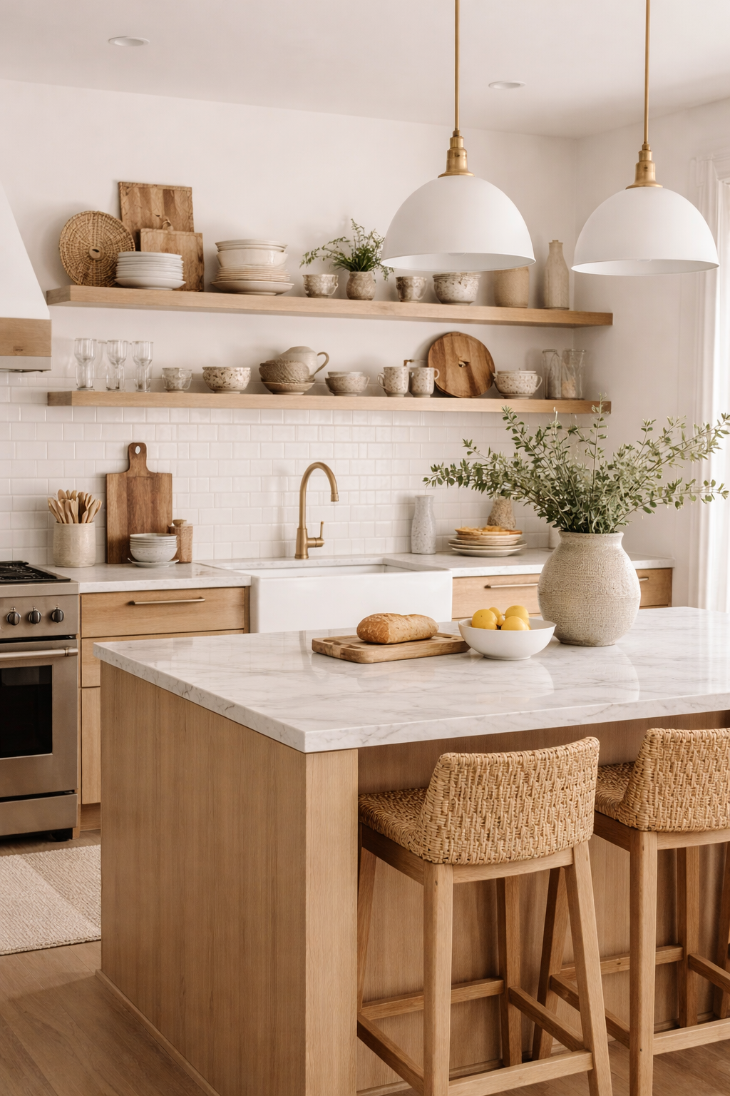
Open shelving would never work in my home, but I do love the look of it. This is a very select trend that should be taken on only by certain households; minimal and organized. Open shelving works when what’s stored is curated and intentional, but not when it’s expected to hide everyday mess. This is hard for most households to achieve (mine included), but when it’s done right, it makes a great visual display for a kitchen.
The upkeep tends to hold a lot of people back, as the shelves require constant adjusting and dusting, since the contents are always on display. Too many items on the shelves look overwhelming, so it might not make sense as a place to hold certain things, such as a large china set. It might be pretty, but it’s not always the most practical.
Trends I’m Happy to Skip
Farmhouse
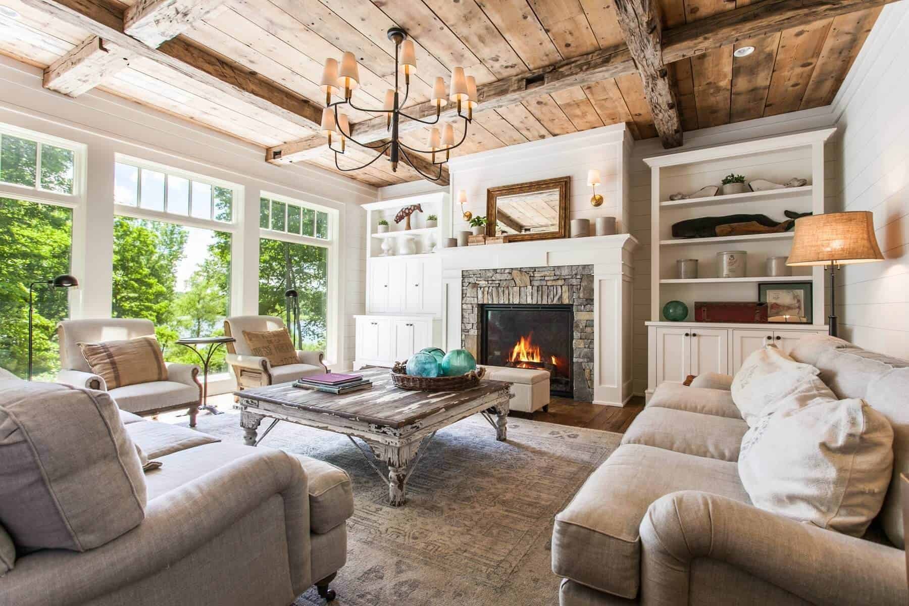
Farmhouse has never been for me. The worn finishes, distressed surfaces, and intentionally rustic details feel more tired than timeless. I’m not drawn to decor that looks rusty, weathered, or like it’s been artificially aged on purpose. I work hard on the upkeep on my home, and I don’t want it to look shabby, like it’s falling apart. I get that some people find it charming, but I never understood why living on a farm meant losing a glamorous interior. Farmhouse just looks like a “before” picture to me, before the repairs are made to a run down interior. Not for me.
Minimalism
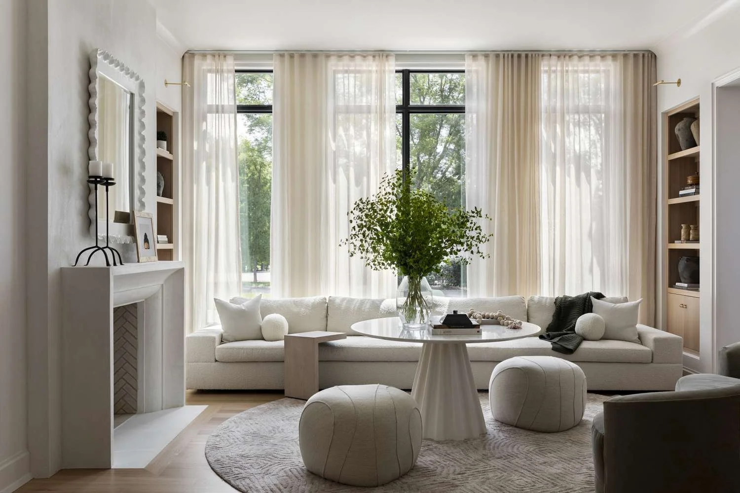
Minimalism is often beautifully styled, and still completely impersonal. Many minimalist spaces feel interchangeable, like they could belong to anyone. I want rooms to feel collected, layered, and specific, not generic. There’s an absence of displaying personal items, family photos, and overall boldness. Now if this is your style, if this speaks to you, then go forth and live your best minimalist life. This just isn’t something that feels like me, which is why I steer clear from it when decorating my home.
A calm space doesn’t mean an empty space, the calmness comes from what relaxes your individual brain. For me, that’s color and pattern. Now if I have to decorate for myself in a minimalist design, I prefer Warm Minimalism, which brings in texture and depth to a space. However, the amount of color I have on my walls probably means that Minimalism just isn’t for me.
Decorative Word Art
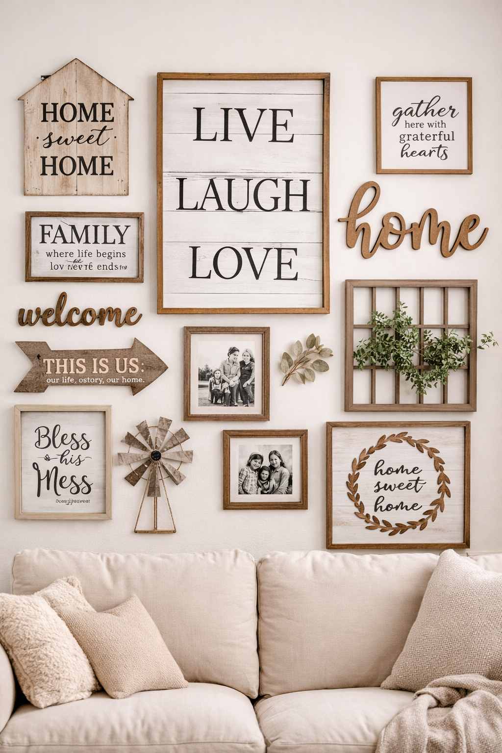
AI Rendering
Your home shouldn’t need captions. I for one do not like my decor telling me what to do, such as my arch nemesis, the empty and generic “Live Laugh Love”. There are more personable ways to show sentiment in the home, by framing family photos, children’s art work, and making collages of special occasions, such as concert tickets and playbills.
The Design Principles That Matter More Than Trends
These are the ideas that guide every design decision I make, regardless of what’s trending:
Intentional layering over excess
Color with purpose
Spaces designed for real life
Editing as an ongoing process
Homes that evolve over time
Bold choices balanced with restraint
The best homes aren’t just trend driven, they’re thoughtful, expressive, and deeply personal.
Final Thoughts
Trends work best when they’re treated like ingredients, not instructions. You don’t need to commit to one style across your entire home to have good design, and you don’t need to avoid trends altogether to create something timeless.
The most compelling spaces borrow thoughtfully: a little glamour here, a moment of color there, something bold balanced by something grounding. Rooms feel better when they reflect how you actually live, not how well you followed a formula.
If you’re drawn to a trend, start small. Try it in a single room, through one piece, or with a detail you can live with for a while. Pay attention to how it feels, not how it photographs. Then build from there.
A well designed home isn’t trend proof, it’s flexible. It evolves as your tastes change, your life shifts, and your confidence grows.
That’s the goal: a home that feels personal, layered, and unmistakably yours, no full commitment required.