Blush Is the New Neutral (And Beige Isn’t Keeping Up)
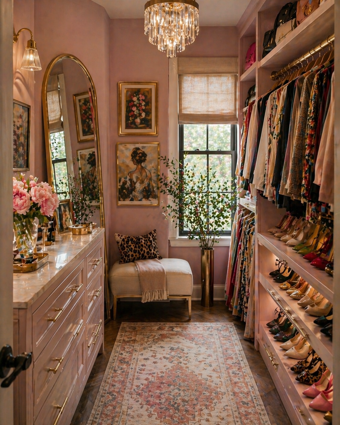
Blush, but make it intentional. This is the direction I’m exploring in my own space right now, and it completely changed how I think about neutrals.
I’m not a neutral girl. I’ve never been a neutral girl. I don’t even pretend to be a neutral girl. If a room can handle drama, I’m going to give it drama. Pattern, contrast, something slightly unnecessary but deeply correct, I’m there. But… every now and then, a space asks for restraint. And apparently, I’m capable of that. Shocking, I know.
Here’s the part that might get me committed: When I do go neutral, I don’t reach for beige.
I reach for blush. Because beige feels like giving up. Blush feels like making a decision. Beige says, “this is nice.” Blush says, “this is done.” And if you’ve ever stared at a neutral room wondering why it still feels unfinished, even though everything technically works, this is probably why.
Let me be clear: beige didn’t fail you. The room just played it too safe. Beige is often the starting point… and then nothing happens after that. No contrast. No depth. No moment where the room actually decides what it wants to be.
Blush, on the other hand, finishes the thought. It brings warmth without heaviness. It reflects light in a way that makes everything feel just a little more expensive than it actually is (we love that). And it layers effortlessly with the things I already reach for: wood tones, brass, black accents, creamy neutrals, a hint of drama on the side. Blush doesn’t scream like my inner thoughts do at 3am…It edits.
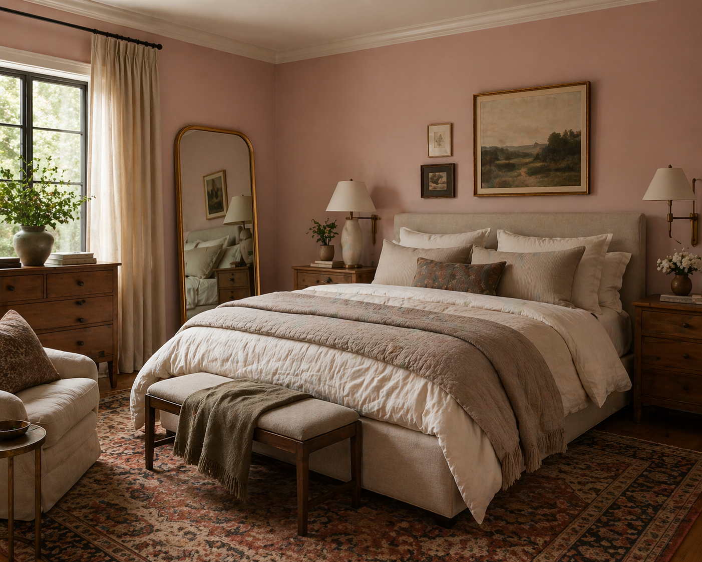
This is where blush really works, it adds warmth and depth, but still lets the space feel calm and layered.
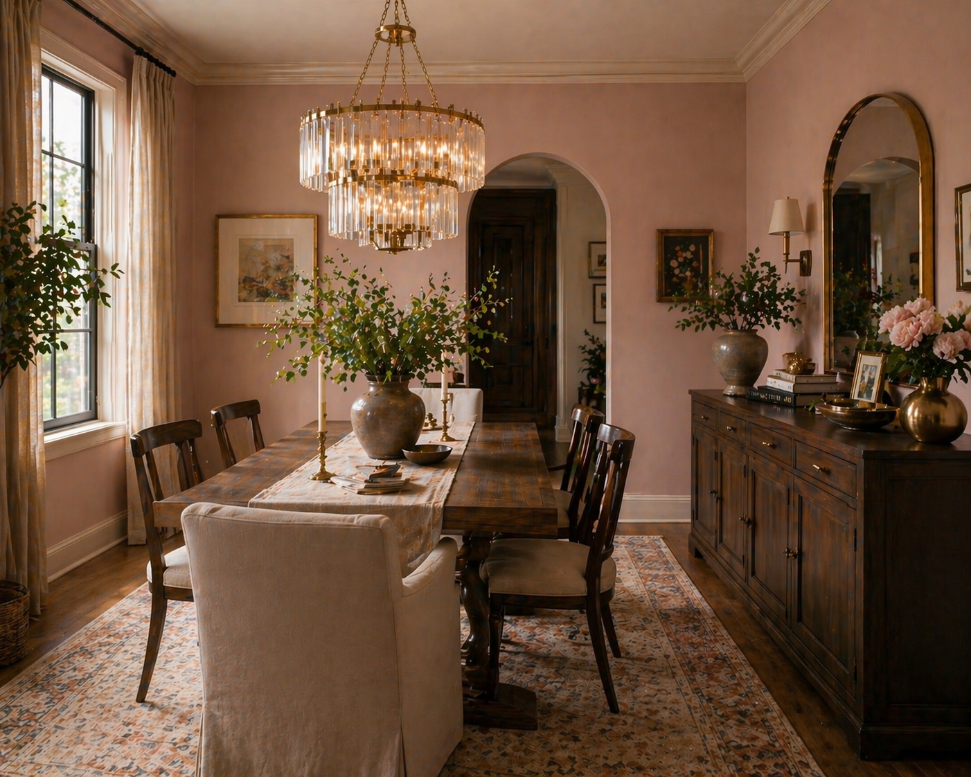
Blush with contrast is where it clicks. The deeper tones keep it grounded so it doesn’t drift too soft.
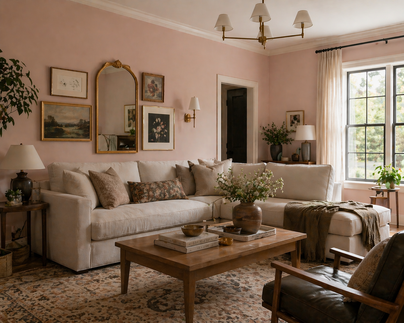
Blush as a backdrop, not the star. It softens everything in the room without competing with it.
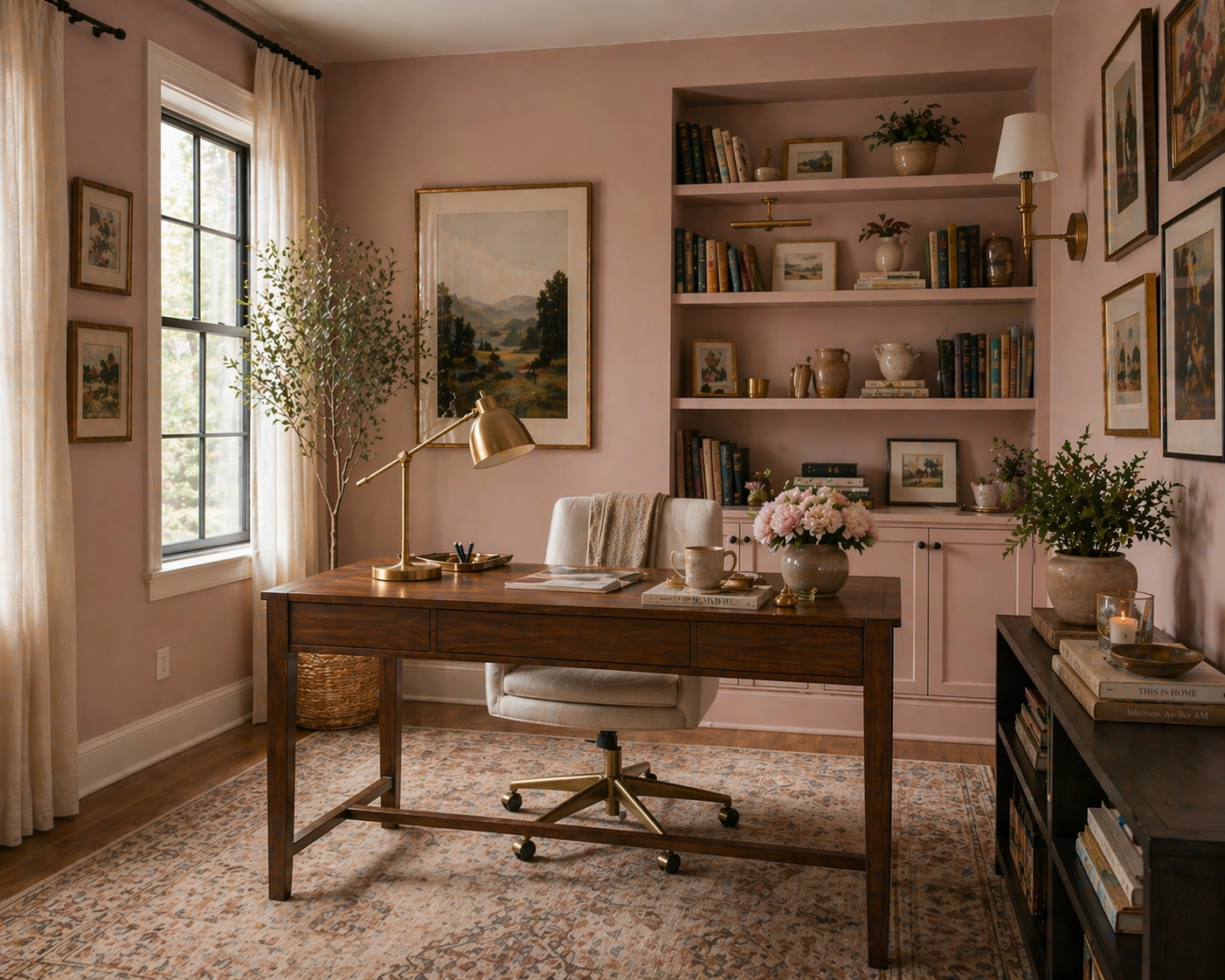
Notice how it doesn’t read as “pink.” It reads as finished. That’s the difference.
Blush is for the person who says: “I don’t like color.” And I’m like… you do. You just don’t like bad colors. Blush is the gateway. The entry point. The “I’ll just try this one thing” that turns into suddenly you have opinions about paint undertones. Next thing you know, you’re color drenching a powder room and defending it like it’s a personality trait. It’s neutral… but it has opinions. Which, frankly, is exactly how I like my neutral interiors.
Let’s Talk About the Fear
“Won’t It Look Too Pink?”
No. And also, this is where people go wrong. If your room looks like a baby shower, that’s not blush. That’s a decision we need to revisit. This is a tone issue, not a life mistake.
What you’re looking for is: Dusty, muted, slightly moody, warm without being sweet.
What you’re not looking for: Anything resembling a highlighter, anything coming across as “fun and flirty”, and absolutely stay away from anything that makes your house feel like it’s about to announce a gender reveal. Blush should feel grounded. Sophisticated. Like it knows exactly what it’s doing.
There are plenty of ways to use blush without letting it get ideas about itself. Because yes, blush is subtle, but she can get a little carried away if you let her. A few ground rules:
Pair it with contrast (wood, black, deeper tones) so it doesn’t float off into softness. Contrast provides depth, visual interest, and prevents the space from feeling flat. If you’ve been paying attention to my ramblings this far, you will recall that flat is what makes a room look cheap. And we’re not about that life.
Let the color breathe. This is not the moment to over style. Allow the color to be featured as an independent part of the overall design, and stand proudly on its own. Even being neutral, let the color make a statement. A statement that says “Look how calm and cohesive I am in this room”.
Treat blush like a neutral, not an accent color begging for attention. Don’t let it steal the spotlight. This isn’t about having a pink room, it’s about having a backdrop that allows for things in your room to pop, without being too stark or dull.
When it’s done right, blush doesn’t feel like “pink.” It feels relaxed and put together, while also feeling deliberate and elevated.
A Quick Side Note (Because I Can’t Help Myself)
Not all blush is created equal, and this is usually where things go sideways. I’m currently deep in a closet project, which means I’ve been staring at blush paint colors like it’s my full time job (without the pay, call my union). I’ve narrowed it down to four options from Behr paint, and they’re all slightly different versions of the same idea:

DUSTY ROSE
This one leans the most traditionally “pink” out of the group. It’s soft and definitely elevated, but it also doesn’t hide what it is, this color shows up. I like it a lot, but I’m aware this is where blush starts crossing over from “neutral” into “we made a decision.”

PINK QUARTZ
This one feels brighter and a little more alive than the others. It still reads soft, but it has just enough lift to keep it feeling fresh… which I love, but it also puts it right on the edge of being a bit too pink if I’m not careful. I like it, but this is where blush can start getting ideas about itself.

CHERUBIC
This is the softest option of the group, like a whisper of blush. It keeps everything feeling light, clean, and very easy to live with… but I’m slightly worried it might disappear once it’s actually on the walls. I know this would be safe. I just don’t know if it would do enough to carry the space. And honestly, do I even want to be safe in this space?

ROSE POTTERY
This is the one I keep coming back to. It has a little more grounding than the others: it doesn’t lean too pink, but it also doesn’t disappear. It feels like that middle point where blush still reads as a neutral, but with just enough depth to actually carry the space. I haven’t fully committed yet… but this is the one that feels the most right.
This is the part no one talks about, blush isn’t one color. It’s a whole range, and the undertone is what makes or breaks it. Too pink, and it starts feeling sweet. Too beige, and you’re back where you started. Too cool, and it loses that warmth that makes it work in the first place. So now I’m in that very specific phase of holding up swatches in different lighting like: “Is this sophisticated… or is this about to become a personality crisis?
So… Is Blush the New Neutral?
I think blush is what you reach for when beige isn’t enough anymore. It’s warmer. Smarter. A little more intentional. It doesn’t ask you to add more stuff to make the room feel finished. It just… finishes it. And if you’ve been playing it safe with neutrals and wondering why your space still feels like it’s missing something, this might be the thing you’ve been avoiding.
Final Thought (Because You Know I Have One)
I don’t do boring neutrals. I do neutrals that know what they’re doing. And blush? Blush is the difference between a room that’s almost there…and one that finally feels finished. Now I just have to decide which version of it I’m living with.